Wednesday, 18 December 2013

18th December 2013 - Pantone

18th December 2013 - Pantone


http://www.pantone.co.uk/downloads/support/FCR/PANTONE_FCR_Spring_2014.pdf  - Link to website

The Image above was created by Pantone and is the starting point for my colour scheme based on the illustrations project.

Pantone LLC, a wholly owned subsidiary of X-Rite, Incorporated, is the world-renowned authority on color. For nearly 50 years, Pantone has been inspiring design professionals with products, services and leading technology for the colorful exploration and expression of creativity.
In 1963, Lawrence Herbert, Pantone's founder, created an innovative system for identifying, matching and communicating colors to solve the problems associated with producing accurate color matches in the graphic arts community. His insight that the spectrum is seen and interpreted differently by each individual led to the innovation of the PANTONE® MATCHING SYSTEM®, a book of standardized color in fan format.
Pantone has since expanded its color matching system concept to other color-critical industries, including digital technology, fashion, home, plastics, architecture and contract interiors, and paint. Today, the PANTONE Name is known worldwide as the standard language for accurate color communication, from designer to manufacturer to retailer to customer, across a variety of industries. Pantone continues to develop color communication and inspirational tools, and aggressively adopts new digital technology to address the color needs of the creative community everywhere.


Tuesday, 17 December 2013

17th December - Colour Scheme Decisions

17th December - Colour Scheme Decisions

Now I have completed some research based on Illustrators, I feel that I should begin drawing again, thinking carefully about the target audience for the project, children. I have looked through a variety of different catalogs from a range of high street stores to gain research and ideas for design colour and style. 

Whilst completing this research I noticed two main styles and applications of colour within the children's patterns. One was a bright, vibrant design, and the other combined pastel colours to create a more naturalistic pattern. I aim to combine the both of these styles in my choice of colours, exploring both the abstract and representational. 

I came across the image above on pantone's website, a colour scheme for women's fashion in spring 2014. this colour scheme stood out to me because of the combination of bold and pastel colours. using this as a basis, I added a few more colour shades, and now I have my colour scheme for this project.

17th December - Research... 'Magic Pencil', British Council and British Libraries... John Burningham

17th December - Research... 'Magic Pencil', British Council and British Libraries


 John Burningham

Born In 1936, John Burningham is a popular illustrator who studied at ‘Central School of Art and design’, London.
As an illustrator, John Burningham creates minimalistic drawings. He believes that drawing is not a mechanical skill such as bricklaying, but something which has to be constantly practiced to maintain style. In his work he believes in creating masses of preparation drawings to get his final illustrations just right. Burningham uses a variety of materials in his drawing, always looking for a lively line. He has no rules for his drawing style, he lets his drawing take him on a journey.

Although Burningham uses the computer to create his illustrations, all of the images used are his own. Even after forty years of creating illustrations, John Burningham does not find it any easier, each new book bring and new journey and opportunity.

17th December - Research... 'Magic Pencil', British Council and British Libraries... Sara Fanelli

    17th December - Research... 'Magic Pencil',                British Council and British Libraries

Sara Fanelli

Originally from Italy, Sara Fanelli came to London to attend act school as she believed it would offer her more opportunities to develop personally as an artist. Whilst at art school, Fanelli developed an interest in collage, to build upon her flat painting, as a way of adding texture and experimenting with composition.
This is an evident part of Fanelli’s Illustrations, creating a bright, abstract style. In her illustrations, she begins by drawing, before layering them using collage to experiment with composition, adding in typography, her own designed lettering.
All of the drawings created by Sara Fanelli are from her travels to cities where she keeps a sketchbook based on museums and other places of interest.

Unlike many of the illustrators I have researched, Fanelli does not use the computer at all. She believes that some artists and illustrators rely on it too much.

Monday, 16 December 2013

16th December - Research... 'Magic Pencil', British Council and British Libraries..... Quentin Blake

16th December - Research... 'Magic Pencil', British Council and British Libraries

Quentin Blake


Quentin Blake is a children's illustrator, famous for his illustrations for the collection of children's books, written by Roald Dahl. Quentin Blake has a very individual style to his illustrations using ink and watercolours to create very definite marks onto the paper. Blake's use of bold and bright colours combine with humorous motifs to create memorable and timeless illustrations
Quentin Blake began his career whilst still at school, creating cartoons for the popular magazine, 'Punch'. Despite this early start, Blake went on to read English at Cambridge and Education at London. It wasn't until Blake had finished as a student before he began art training. Blake became a part-time student at Chelsea Art School where he learnt about drawing bodies. This is where Blake met Brian Robb, who later gave Blake a part-time teaching post.
Quentin Blake pays his success in illustration to his magazine work where he learnt the spontaneity of drawing which allowed him to be free in his work.

16th December - Research... 'Magic Pencil', British Council and British Libraries..... Lauren Child

16th December - Research... 'Magic Pencil', British Council and British Libraries

Lauren Child

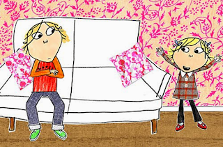
Lauren Child is a children's and author whose work is instantly recognisable with a mixture of hand drawn and computer created illustrations. Lauren Child's combination of traditional and digital work in harmony to create bold, colourful and playful imagery.

Lauren Child studied at 'Manchester Polytechnic' and 'City and Guilds of London Art School'. She found art school boring due to the lack of discovery and excitement. Inspired by illustrators such as Quentin Blake and E.H. Shepard, Lauren Child discovered a passion for creating books and stories aimed at children.
In the creation of her illustration, Lauren Child uses the computer to create a variety of different back grounds using a range of sources like collage and photographs. From here she scans in her hand drawn figures which she superimposes onto the back grounds.
Lauren Child is probably best known for her collection of 'Charlie and Lola' stories which have been turned into a children's programme.

16th December - Research... 'Magic Pencil', British Council and British Libraries..... Tony Ross

16th December - Research... 'Magic Pencil', British Council and British Libraries

Tony Ross


Tony Ross is a children's book illustrator known for his varying drawing style. he is probably best known for his 'The Little Princess' illustrations which have influenced a hit children's programme.
Whilst studying illustration at art school, Tony Ross noticed that most illustrators stick to the same style of drawing throughout their careers. Ross did not want to commit himself in that way, instead his style of drawing often changes based on the context of the illustration.
Tony Ross trained as an etcher, so believes that line and the actual drawing come before the colour additions, that line is more important than the use of colour. This is one the main rules Tony Ross taught as a teacher of illustration,
Tony Ross draws mainly using a dip pen. He describes it as his most important tool, but that the choice of nib is extremely important to the relationship the illustrator has with their illustrations.

Sunday, 1 December 2013

1st December - Article analysis, Libertys goes digital

1st December - 
Ba4 Research... Libertys Goes Digital


Libertys Digital print scarf
A while back whilst researching Melanie Bowles, I realised that she co-founded 'The people's print', (www.thepeoplesprint.blogspot.co.uk). 

This blog looks into the newest trends in digital textile design. The People's Print pioneers new concepts for textile design combining traditional and digital technologies, open source, participatory and co-design, aiming to create a community of like minded people with a passion for designing their own textiles.

Libertys Digital Print dress
"Liberty is one of the last great emporiums for innovative and eclectic design. Situated in the heart of London since 1875, it remains to this day the destination of choice for the savvy and sophisticated shopper. At Liberty, a rich heritage combines with the cutting edge and avant-garde, making each visit a voyage of discovery and excitement. We hope you will be inspired and delighted by our carefully selected offering of beautiful and luxurious products. We welcome you into our eccentric, indulgent and utterly charming world, and invite you to get truly lost in Liberty." - extract from Libertys website.

The department store Libertys is well-known for their ranges of screen-printed fabrics. to keep up with the changing nature of the textile pattern industry, they have created a range of digitally printed fabrics. I would like to research 'Libertys' and their fabric collections further with the mixture of traditional and more modern print techniques.

30th November - 'Scarves' research findings

30th November - 'Scarves' research findings

Following my research into scarves over the past couple of days, through the book, 'Scarves', Nicky Albrechtsen and Fola Solanke', I have learnt a great about the scarf, not only in the fashion sense. The scarf is a versatile piece of fashion, which although may change from season to season always manages to appear in the great fashion collections. It can be a piece of art and fashion statement or an object to help keep you warm on a cold, blustery day.

Looking back at the eras and the development of the scarf I can see behind it sole purpose, which I first associated it with. I first believed that scarves were for warmth, that was their purpose and that this project was going to us all sitting around a table knitting like our grannies. I have found the knowledge from the 'scarves' book invaluable, this with some market research, which can be viewed on my pinterest page (http://www.pinterest.com/nathanmison9/), has helped me to realise that the work we are doing is valid and following the trends of fashion. It may be winter here, but the fashion scarf create from delicate, soft silks and other such materials are still a key item of fashion. 

Research is something which I now realise as invaluable, I just wish I had have realised this earlier on in the project, as well as drawing this makes the backbone of projects. Sure pattern making and digital skills help, but the core is research both visual and textual. 

I shall definitely carry on to realise the importance of research and continue to use it to aid me throughout this project as well as in the future.

30th November - Project Research... 'Scarves', Nicky Albrechtsen and Fola Solanke

30th November - Project Research... 'Scarves', Nicky Albrechtsen and Fola Solanke


'Scarves', Nicky Albrechtsen and Fola Solanke
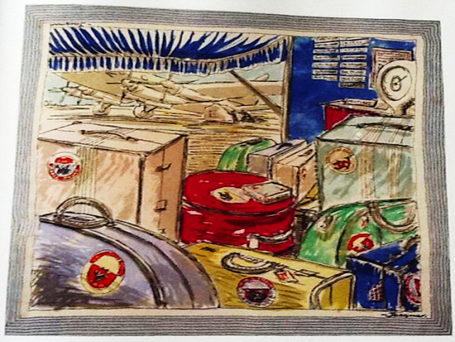
Scarves, The Travel Scarf

In the 1950s, prosperity soared and was accompanied by the development of rapid air travel which was able to take people from all social classes to foreign places.
The headscarf was a popular fashion accessory in the 1940s and a vital part of a woman's travel wardrobe. It was seen as the perfect medium for advertising in the travel and holiday industry.
The souvenir scarf was a memento of the holiday destination, but also the mode of transport, such as an airline scarf.

Saturday, 30 November 2013

30th November - project research... 'Scarves' Nicky Albrechtsen and Fola Solanke

30th November - Project Research... 'Scarves' Nicky Albrechtsen and Fola Solanke


Scarves, Textiles Designers
'Scarves' Nicky Albrechtsen and Fola Solanke


It is unusual to find scarves created by textile designers, many of their designs have been used anonymously by major scarf manufacturers.
Raoul Dufy is a pioneer of early scarf design, a French artist inspired by the art nouveau movement. In 1912, Dufy worked exclusively for Bianchini-Ferier, a silk weaving firm. His scarves are virtually impossible to fined, except through private auction houses.
Tammis Keefe was an American designer whose scarves are easily obtainable. Trained in the 1930, most of her designs are based in the 1940s which usually depict animals or American landmarks. Many of her mass-produced patterns are still available.
Sandra Rhodes is an extremely successful British fashion and textile designer whose designs are inspired by the 1930s. Much of her work is based on sketchbooks kept whilst on her travels where a variety of motifs are collected together. Her scarves are hand screen-printed on chiffon, tulle and silk.
Althea McNish provided designs in the 1950/60s for a number of well established scarf companies such as Libertys and Jacqmar. Originally from Trinidad and Tobago, McNish was one of the first black British textile designers who brought large, colourful Caribbean florals to post-war Britain. McNish was never credited by name on her scarves.


29th November - project research... 'Scarves' Nicky Albrechtsen and Fola Solanke

29th November - Project Research... 'Scarves' Nicky Albrechtsen and Fola Solanke


Scarves, Artist Scarves

'Scarves' Nicky Albrechtsen and Fola Solanke

From the start of the 20th century, artists have used scarves as a soft canvas for their work. After the Second World War when the art market was trying to recover after the conflict, many artists were brought in to create designs for the commercial textile market, including scarves.
Ascher Ltd was the first company to work with established artists in creating scarf designs. The majority of these designs were created between 1943 and 1951 with more than 50 artists contributing. However, it is not Ascher that is most well known for the commission of these scarves, many designs were commissioned by Jacqmar. Each of the scarves were treated as fine art and although we're not commercially successful, inspired trends key to the 1940s and 50s.

Friday, 29 November 2013

29th November - Scarf Sketchbook, Colour Scheme Choices

29th November - Scarf Sketchbook, Colour Scheme Choices

A quick and easy way to narrow down my movement towards creating a final design quickly is to start off with a focused colour scheme. If I try to keep to this colour scheme throughout all of the stages of research, drawing and development, then I can experiment further with design and composition, adding my colour scheme later on. This is not a way of working that is approved by my tutor, but I feel that after my tutorial of 27th November, my focus should be more of the design rather than the use of colour scheme.

Focus of the colour scheme, a scarf from the LIBERTYS collection


Larger scale colour scheme displaying all the visible colours from the scarf image

Smaller, chosen colour scheme for this project.

28th November - Starting Pointing, Scarf Sketchbook, High-Street Research

28th November - Starting Pointing, Scarf Sketchbook, High-Street Research


To start the re-think of the scarf sketchbook section of this project I have decided to complete some visual research based on what is already out their for my target audience, Women aged 18-45. Looking at what is on offer for my target audience on the high street, both lower end and higher end. this has given me a valuable insight into the creation of the scarf and the colour scheme I decide to use.

A rail of scarves from MATALAN
Detail of scarf from collection at MATALAN

Autumn/winter collection, from the NEXT catalogue
Collection of scarves, autumn/winter from LIBERTYS

Following my research into the high-street market I think I need to redefine the focus of this project, after all I am looking into architecture of Norwich. I think that all my previous designs have been to focused around a must to look 'pretty', they all have a floral feel to them. I am looking at architecture, so I think my repeat structures need to be more structured. 

Thursday, 28 November 2013

28th November - Explanation of Change of Direction for Project.

28th November - Explanation of Change of Direction for Project.

Following my individual tutorial on the 27th November, I have decided to re-think the way I am working in both sketchbooks of this project. Whilst in the tutorial, there were two main points which kept coming up in both sketchbooks;

1. I need more primary images and first hand drawing for more motifs, so I will have more to work with.
2. More research is definitely needed. this will created a more informed project and my designs will have more of a purpose.

I now hope that because I have a focus to the sketchbooks again that I shall get more work done, that I will be more infused to create more work.

As posted yesterday, the notice about my change in the course of my work will be placed in each of my sketchbooks to give a clear indication of my step backwards and re-visiting of research. I aim to post on here more regularly to keep a record of my progress for me and others, to keep up the momentum.

My first starting point will be the second sketchbook, based on the creation of a repeat scarf as a final product, after this I will go back to the first sketchbook.
I will start both projects with further research and more sources of primary visual research

27th November - Individual Tutorial, A Change To Plan


 27th November - Individual Tutorial, A Change To Plan


Following a tutorial on the 27th November, I have decided to re-think the progress of this project BA4.
I shall be taking a step backwards thinking carefully about colour and context especially.


Wednesday, 27 November 2013

Monday, 11 November 2013

Contextual Studies - digital design focus


Contextual Studies - digital design focus

Digital print textile designers

Becky Earley - beckyearley.com, photographic approach. Recycling
Kate Goldsworthy
Cyril Walter Crentsil - menswear pattern designer based on quilting
Liberty Digital Print Collection
Melanie Bowles - makeitdigital@blogspot.com, discusses globalisation and individual communities. 'consumer curated design'
Claudia Catzeflis -subtle digital design
Mary Katrantzou - everyday object digital prints
TED - Textile Environment Design
Alexander McQueen
Prada

These are just few of many designers who are following the digital trend and have adapted their way of working, moving into areas of digital print,beach from a very different angle. 


For presentation, research three examples of a great presentation layout - magazines etc.
                             Look at the balance of images and text.
25th November, email presentation to Les. Bring to contextual studies to talk through layout.

Thursday, 7 November 2013

Lecture - Lisa Stickley/Levis

Lecture - Lisa Stickley/Levis 
http://www.bettyandwalter.com/pages/about

THE BETTY & WALTER STORY


Creative founder of Betty & Walter, Lisa Levis (nee Stickley) is a British designer known for her unique & illustrative Prints. Inspired by mid 20th century design and influenced by people & places significant to her, Lisa’s designs begin life as drawings & paintings of her own hand.

Aunty and Uncle to Lisa, Betty & Walter lived in The Bungalow on 5 Elms Road. Being cattle dealers for the local farm, most working days were spent at cattle markets and the rest of their time was filled with cooking steak and kidney pie, tending to honeysuckle and harvesting raspberries, going to parties to play matchbottle and newmarket and drinking Camp Coffee!

Uncle Walter often wore chestnut coloured trousers and enjoyed watching the horse racing on a Saturday in his armchair. Aunty Betty had a fondness for marble cake which she would eat whilst wearing her flowery apron.


Betty & Walter is a brand with product of good value & quality. With its twist of vintage retro B&W accessories are feminine, practical and easy to use, complete with well thought out functionality and attention to detail.

Bags and purses with quirkily hidden printed pockets, brilliantly bold blocky handles and considered features the Betty and Walter bag does its job whilst being wittily stylish at the same time. With mugs, tea towels, aprons and frilly pinnies, B&W is a cheery addition to your kitchen too!
A little Lisa Levis!

Wednesday, 6 November 2013

Placement Lecture


Placement Lecture

The lecture today was based on our placements in a design area. these can take place at any time during this year, but aren't assessed until the end of BA6. During Ba6 we will have to complete a 2000 word essay describing, summarizing and evaluating our time spent in our placement. as well as this we will have to give a 10 minute presentation about how our placement has effected our sketchbook work. This will take place in May 2014.

From now on we will continue to talk about our placements, choosing our placements, writing our CVs and covering letters. everything needs to be PLANNED in advance. Can you afford it? Can you get there? Do you need accommodation? You need to be flexible!

1. Produce a creative CV (with images)
2. Write a covering letter

*ORGANISE PLACEMENT AS EARLY AS POSSIBLE*

Be persistent and don't be afraid of being a nuisance.

MAKE SURE YOU LET KAREN KNOW WHEN YOU WILL BE AWAY!!
Keep a detailed PDP journal based on your time at the placement.

MUST BE COMPLETED BY 16TH MAY 2014!!

Tuesday, 5 November 2013

Group Task, Printing Our Length


Group Task, Printing Our Length

Today we had out session in the print room, printing our group length. This was a very technical task, involving a lot of measuring and lining up, so our layered print would print as smoothly as possible, and would hopefully create a perfect layered print. This involved lining up the print pegs and masking the edges of the screens, so there would be no marks on the fabric.

After doing this we had to mix our colours. Because we were creating a large scale length, one of the tutors suggested that we use acid dyes on our silk instead of reactive dyes. This is because the acid dyes give a more vibrant colour on the silk. However, when experimenting with dyes and choosing our colour schemes we used reactive dyes,so when we came to mix our colours for our length we had to experiment a little to obtain the colours we had before...
15g of acid red : 500g of print paste.
12g of acid Navy : 500g of print paste.

Then we were ready to print. we put our first screen down on our fabric and printed, but  some of the design smudged leaving blotches. We were told there could be a number of reasons because of this so we checked the screen to make sure it was ok and were careful when we next printed it not to put so much dye down. When we printed it the second time the print came out fine, which even confused the tutor. Perhaps the fabric was a little damp?

From here, we repeated the print until we had finished both layers of the desgn, images displayed below. I think the design looked absolutely amazing, the blue and red worked very well together. 


Friday, 1 November 2013

EXHIBITION - The March Hare Collective and Green Initiative @ The Apex


EXHIBITION - The March Hare Collective and Green Initiative @ The Apex


Today I went to the 'March Hare Collective and Green Initiative at the Apex, Bury St Edmunds. This was an exhibition of local artists with a green or Eco-friendly message to their work as well as local Eco-friendly business initiatives.

There was a wide array of hand crafted goods and pieces from, natural lip balms (the bees wax co.) to small sculptures carved from polished wood. Whilst looking around at the huge exhibition I was particularly interested in these amazing stained glass pieces created from reclaimed glass and natural dyes.

Another art, card attached, created textile landscapes using felted sheeps wool to create landscapes based on the Yorkshire moors. These pieces were bold and vibrant, ans whilst a tricky material was used, no compromise was made in term of quality. The animals in each of the pieces were clear, and there was a defined landscape. 


The exhibition was a little chaos and there was things to look at, at every angle. This is probably because of the nature of the exhibition, more of a trade show, with artists selling there work. Each stall/area was different, but it was all focused around the idea of being Eco and using what we have around us to create pieces of art. I enjoyed this as it made me think about all the possibilities of one subject area. This is evident in our own work focusing on Norwich. Although we all have the same project title, we have taken very different routes and technique choices, but will end up with similar outcomes, not in style but in object, a scarf.

Thursday, 31 October 2013

Group Tutorials - 31st October


Group Tutorials - 31st October

The tutorials today gave me my first opportunity to take a peek at other people's work, based on the scarf project. One of the main things that stood out to me was everybody's use of photoshop, adapting images and creating digital patterns. Considering this is a digital project, it is something I definitely need to think about using. From digitally created Photoshop patterns, I aim to re-draw these by hand, adding personal elements as to make the repeats less rigid and digital, reflecting my way of working more.

Another thing I need to think about is the theme running through this project, NORWICH. Something which kept coming up time and time again was making sure that it is clear the Norwich is an evident theme in the project drawings, but also heading into the final scarf design. There must be clear and visible links which are obvious to those who are not following our work. This will be difficult to bring into my work as I am focusing on the details of decorative architecture of Norwich. Perhaps I can overcome this difficulty through use of colour scheme and by looking into decorative lettering, such as pub signs too. This would bring me back towards the theme of Norwich.

For this reason I think one of my main next steps is to create a mood board based on the colour schemes that I think reflect Norwich, and how they are used in fashion and textiles. I must continue with my drawings in order to keep coming up with new ideas and designs for my scarf project and I really need to start thinking about materials and digital techniques I want to be using in my final scarf design.

Lecture - Bonnie Kirkwood


Lecture - Bonnie Kirkwood 


INFORMATION FROM BONNIE KIRKWOOD WEBSITE.

Multi award winning, Royal Collage of Art MA graduate, Bonnie runs her own successful global bespoke woven textile design and fabric consultancy business.
Based in central London, at Cockpit Arts Studios, Bonnie works internationally for the highest contemporary interior design market. She has an extensive and varied experience in both the interior and fashion industry working with impressive names such as Designers Guild, Christian Lacroix and Paul Smith, and with individual established design studios and worldwide fabric mills, in the commercial and luxury high end markets.
Bonnie's personal bespoke woven textile design and consultancy service, encompass the design, development and production of woven fabric, for residential and commercial interior use, working with individual customers, private homeowners, and in collaboration with individual architects and their clients.
Illustrating inspirational vision, expertise, eye catching colour, exquisite intricate structures and superior quality, Bonnie's designs have gained worldwide acclaim by prestigious interior design showrooms, and her contemporary inspirational hand woven designs are brought by international companies, by the likes of CK Home, DKNY, Boden, Mark and Spencer, and Abercrombie and Fitch to name a few.

Bonnie Kirkwood is a designer focusing on weave structures. Based in London, Bonnie works with individual clients and as a consultant and trend forecaster to larger companies. With extensive technical and market knowledge, Bonnie Kirkwood is able to balance freelance work with design consultancy, for European and far eastern mills, creating and designing collections of furnishing and home fabrics.
As a freelance designer, Bonnie Kirkwood creates broad ranges of both hand and jacquard woven fabrics for high end fashion and interior design companies.